
Smart choices in small spaces
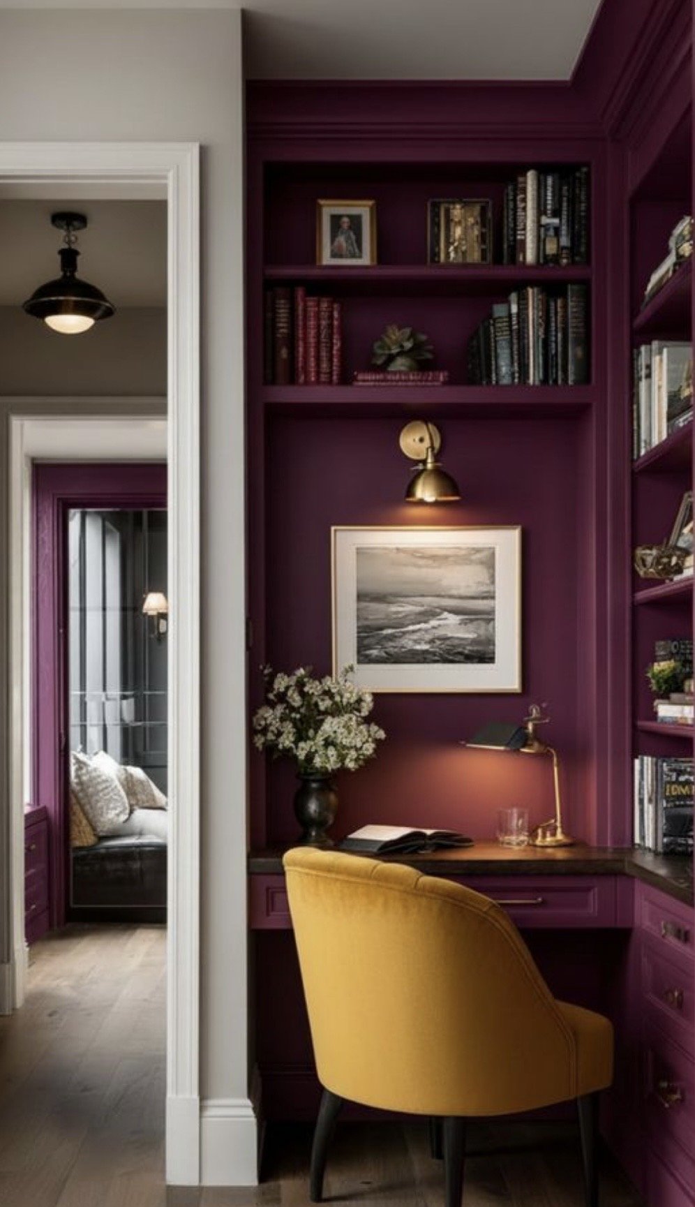
Why good small-space design is less about size and more about strategy.
Small spaces reveal very quickly whether a design decision was intentional or not. There is less room to hide behind excess. Less room for unnecessary furniture, decorative gestures, or layouts that don’t fully work. Every element becomes more visible because every square meter matters more. For this reason designing compact spaces often requires more discipline than larger ones.
One of the biggest challenges in smaller interiors is spatial demand. The room rarely serves just one purpose anymore. It has to display, store, allow movement, create atmosphere, sometimes even shift function throughout the day - all without feeling crowded.
Thinking horizontally only - a first mistake
And this is usually where people make the first mistake: they only think horizontally. They drift towards more shelving to store all the clutter. Buying small scaled furniture, since you are dealing with a small space, no? Or pushing everything against the wall to make space for enough circulation mid-room.
Alas, all these thoughts may achieve the opposite than what was intended. Often, the better solution is to think vertically instead.
In one of our recent projects, that shift changed the entire experience of the space. Rather than filling the floor further, we focused on what was happening above eye level. A stronger lighting plan and a ceiling mural became the connective tissue across the interior, visually guiding the eye through the different zones while keeping the footprint itself relatively open.
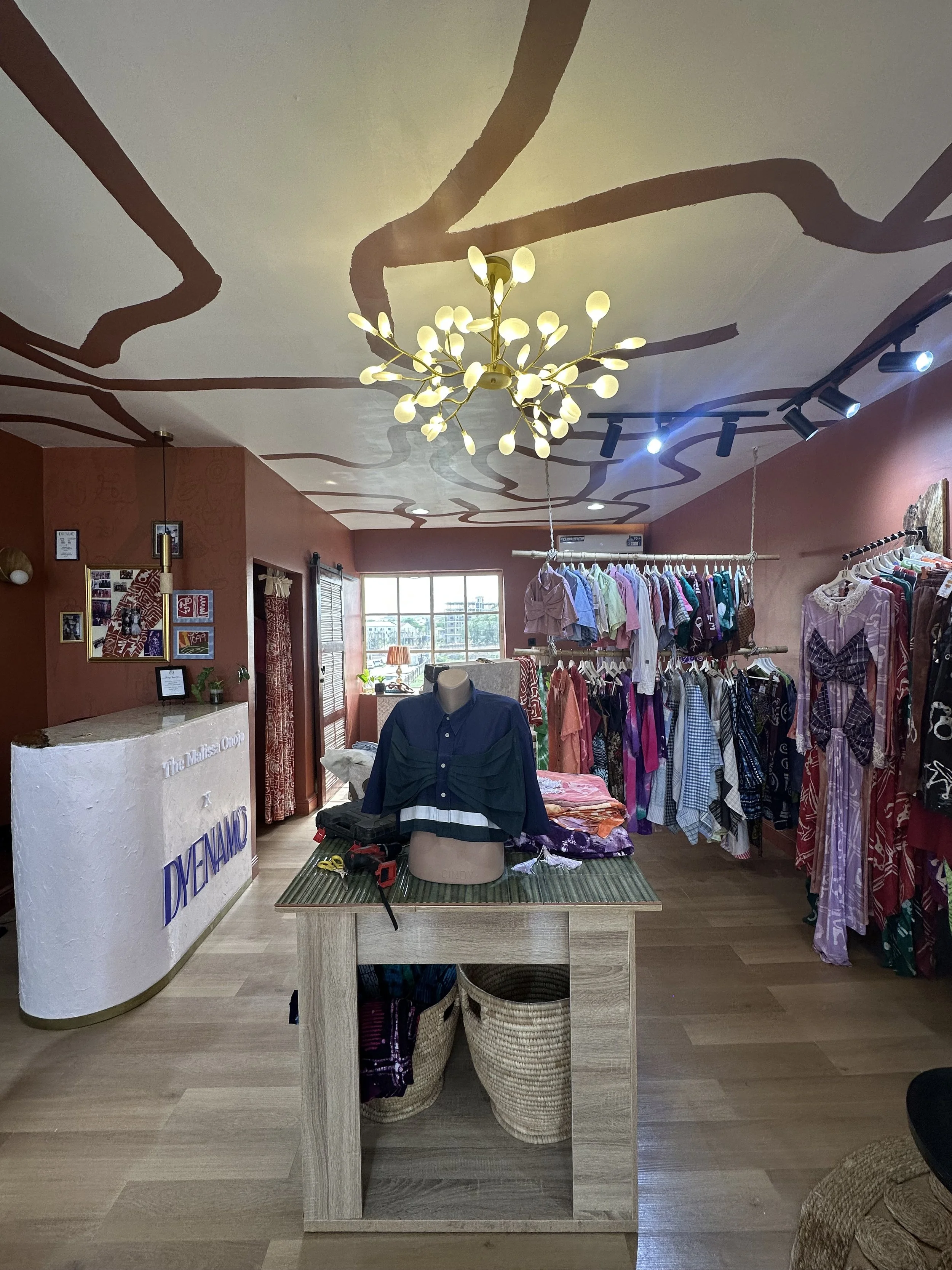
The result was subtle, but powerful. The space felt taller (despite reducing the ceiling height by 25cm to conceal an offset ceiling beam and introduce a new ceiling plan), calmer and more airy, even though its functionality increased significantly. Good spatial strategy is rarely about adding more, but directing the attention with intention.
Double-duty is a must
Another important lesson in smaller interiors is that objects cannot afford to be passive. Every piece has to contribute something beyond appearance. That is where double-duty design becomes essential.
The central table in the project functions as a visual anchor, but also actively supports interaction and movement throughout the store. The mannequin display does the same. These pieces are not separate from the experience of the space. Instead, they shape how the space is actually used.
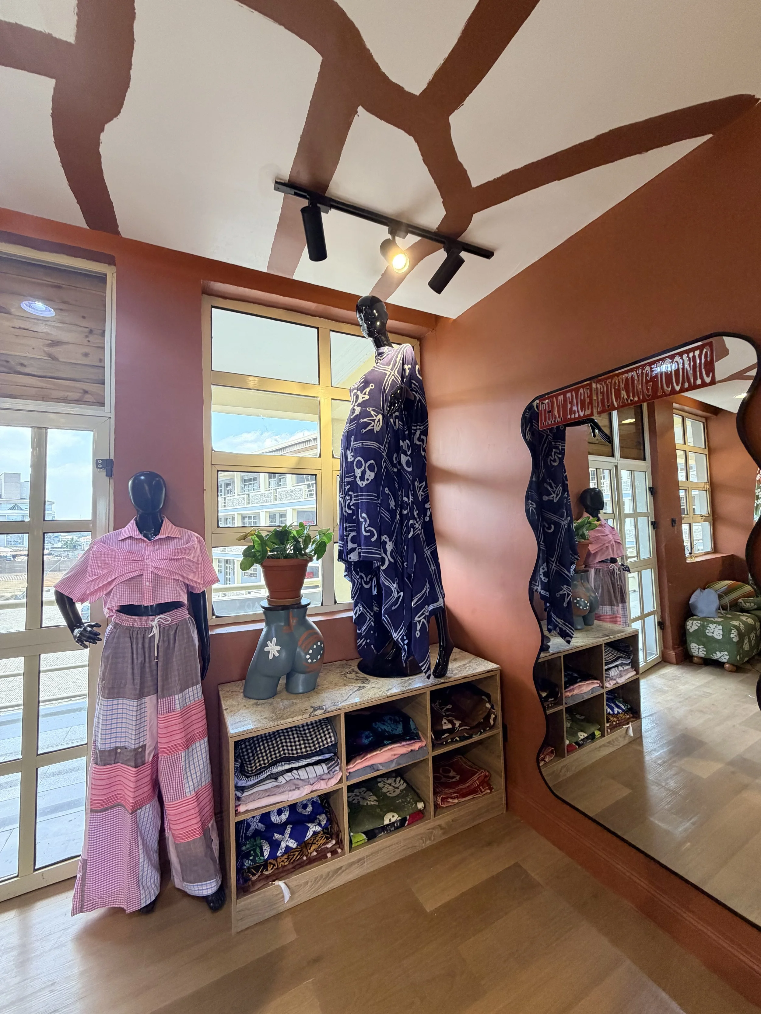
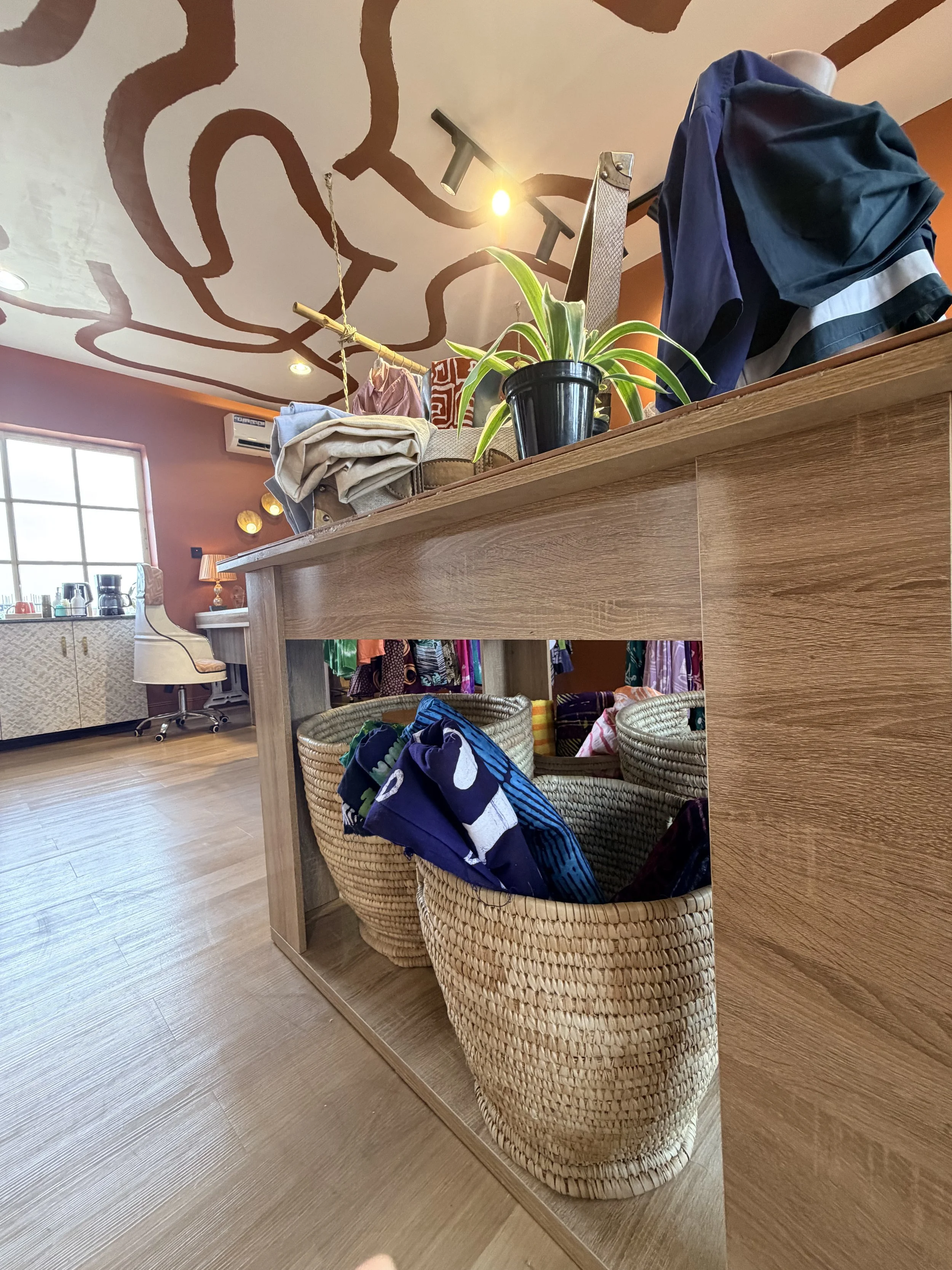
The best small spaces are rarely the emptiest or the most minimal. They are the ones where every decision feels considered. Where circulation feels natural and the eye can rest. Where function has been integrated so seamlessly that the space still feels effortless.
Because ultimately, spaciousness is not always about square footage. The sense of spaciousness can as well arrive from design clarity.
